Supply and demand in Australia’s property market: what investors need to know
In Australian housing, the balance between supply and demand is the single most powerful force setting prices and rents. When demand outpaces supply, vacancy rates fall, rents rise, and prices follow. When supply floods a market, the reverse happens, often faster than investors expect. Three facts define the current Australian context: the Reserve Bank of Australia (RBA) and Australian Bureau of Statistics (ABS) provide the foundational data; CoreLogic tracks real-time price and vacancy signals; and Australia is running a persistent structural undersupply that keeps vacancy rates near historic lows across most capitals. For investors, this imbalance creates a familiar trade-off: undersupplied markets tend to deliver capital growth but compress gross rental yields.
- National residential vacancy rates have remained near 1.2%, according to KPMG’s residential property market outlook, well below the 3% level that typically signals a balanced rental market.
- BDO projects roughly 938,000 dwellings will be completed between 2024 and 2029 against a National Housing Accord target of 1.2 million, a shortfall of around 262,000 homes.
- Gross house rental yields fell from approximately 4.0% in 2012 to around 3.5% by mid-2022, reflecting the capital-growth bias baked into Australia’s undersupplied urban markets, per the Stockbrokers and Investment Advisers Association.
The investor implication is direct: in undersupplied markets, capital growth tends to outperform yield, but that growth is not guaranteed when rates rise or new supply clusters arrive.
Key takeaways
Australia’s chronic housing undersupply, with a projected shortfall of roughly 262,000 dwellings against the National Housing Accord target by 2029, is the dominant force shaping capital growth prospects across most major cities.
| Point | Details |
|---|---|
| Vacancy leads prices | Watch vacancy and advertised rents first; prices follow by 6–18 months, giving you an early entry signal. |
| Supply lags are long | Approvals-to-completions typically run 18–36 months, so near-term supply relief is rarely as close as headline approval data suggests. |
| Elasticity amplifies shocks | RBA modelling estimates a 1% supply increase can reduce prices by around 2.5%, meaning small imbalances produce outsized price moves in both directions. |
| Capital growth vs yield trade-off | Gross house rental yields compressed from ~4.0% to ~3.5% between 2012 and mid-2022 as capital growth outpaced rent growth in undersupplied cities. |
| Wealthstacker for scenario testing | Wealthstacker’s suburb overlays, automated valuations, and 15-year modelling tools operationalise the supply-demand framework for real investment decisions. |
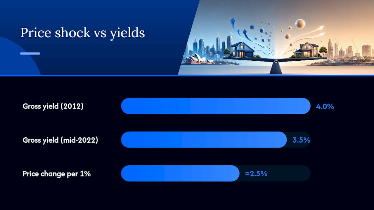
Table of Contents
- How does supply work in the housing market?
- What drives housing demand in Australia?
- How do supply and demand translate into rents and prices?
- What indicators measure supply-demand balance at a suburb level?
- What are the early signals of oversupply and undersupply?
- Which policy and macro levers shift the supply-demand balance?
- What do supply-demand dynamics mean for investment decisions?
- How do you build a suburb-level supply-demand model?
- Australia’s housing market in 2024–2026: supply shortfalls and state variations
- How supply-demand imbalances drive capital growth over time
- How does speculative demand shape property market dynamics?
- How do international factors affect Australian property supply and demand?
- How do supply-demand dynamics differ across Australian cities?
- Wealthstacker makes supply-demand analysis practical for investors
- Sources
How does supply work in the housing market?
Housing supply is not a tap you can turn on quickly. It is a pipeline with multiple stages, each introducing delay and uncertainty.
The supply pipeline runs from approvals to completions. A developer secures planning approval, then arranges finance, then breaks ground, then completes construction. In Australia, the gap between approval and completion for a medium-density project typically runs 18–36 months. High-rise apartments can take longer. During that window, market conditions can shift dramatically, and many approved projects never reach completion if developer feasibility deteriorates.
The components of supply include:
- New approvals: the number of dwellings granted planning permission in a given period, tracked monthly by the ABS
- Completions: dwellings actually finished and added to the stock, which lag approvals by months to years
- Existing stock: the total dwelling count, reduced by demolitions and conversions (offices converted to apartments, or vice versa)
- Demolitions and change of use: often overlooked, these reduce net additions even when gross completions look healthy
Supply is also constrained by factors that have nothing to do with demand. Land availability and zoning determine where building can occur. Planning complexity and infrastructure timing slow approvals. Labour shortages and materials costs determine whether approved projects are financially viable to build. The UDIA’s State of the Land 2026 report documents how rising construction costs and feasibility constraints are limiting higher-density supply across major cities, with greenfield pipelines remaining a critical delivery channel.
A key timing point: a spike in building approvals does not translate into more homes for 18 months or more. Investors who see a surge in approvals and assume supply relief is imminent are often wrong. The AHURI Final Report 399 notes that supply is inherently cyclical and can collapse quickly when construction costs rise, precisely the dynamic Australia experienced from 2022 onwards.
What drives housing demand in Australia?
Demand for housing comes from four distinct groups: owner-occupiers buying to live in, renters seeking accommodation, investors purchasing for yield or growth, and speculative buyers anticipating price appreciation. Each group responds to different signals, and their relative weight shifts across the cycle.

The core demand drivers break into two categories.
Structural (long-run) drivers:
- Population growth and net overseas migration, which adds households directly and is the dominant long-run demand lever in Australia
- Urbanisation and the concentration of economic activity in Sydney, Melbourne, Brisbane and Perth
- Household formation rates, which determine how many dwellings a given population actually needs (smaller average household sizes mean more dwellings per capita)
Cyclical (short-run) drivers:
- Interest rates and borrowing capacity, which determine how much buyers can bid and whether investors find the numbers stack up
- Income and employment conditions, which affect both the ability to service debt and the willingness to commit to a purchase
- Tax settings, including negative gearing and the capital gains tax (CGT) discount, which shape investor demand specifically
- Sentiment and media narratives, which can accelerate or suppress demand independently of fundamentals
The distinction matters for investors. Cyclical demand can reverse quickly. Structural demand, particularly migration-driven population growth, tends to persist across cycles and provides the floor under long-run price growth.
Pro Tip: Monitor the ABS’s net overseas migration quarterly release and the Department of Home Affairs’ visa grant data. These are the earliest leading indicators of structural demand shifts, typically running 6–12 months ahead of visible rental market tightening in gateway cities.
How do supply and demand translate into rents and prices?
The transmission from supply-demand imbalance to prices runs through two intermediate steps: vacancy rates and rents. Prices are the last thing to move, not the first.
Vacancy rate as the immediate signal. When demand exceeds supply, the pool of available rental properties shrinks. Vacancy rates fall. Landlords face less competition and can raise asking rents. Rising rents then feed into prices through the user-cost model.
The user-cost model treats housing as an asset whose price reflects the cost of occupying it. The user cost of owning a home includes mortgage interest, rates, maintenance, and the opportunity cost of capital, minus expected capital gains. When rents rise, renting becomes more expensive relative to owning, which pushes more households into buying and bids up prices. The RBA’s research formalises this: supply shocks operate via vacancy and rents, and the RBA estimates that a sustained 1% increase in dwelling numbers can lower the user cost of housing enough to reduce prices by a multiple of that initial supply change, with an inverse elasticity near 2.5 in their simulations.
That elasticity figure is worth sitting with. People need somewhere to live. When supply tightens even modestly, competition for available stock intensifies disproportionately. The reverse is also true: a modest supply addition can deflate prices more than the raw numbers suggest.
Timing and lags are where most investors get caught out:
- Vacancy rates respond within weeks to a demand or supply shock
- Advertised rents adjust within 1–3 months
- Transaction prices adjust over 6–18 months, and sometimes longer in illiquid markets
- New supply responses take 18 months to several years to materialise
Pro Tip: Track advertised rents on SQM Research or Domain alongside CoreLogic vacancy data. When rents are rising sharply but prices have not yet moved, you are typically in the early stage of a tightening cycle, the best entry point for capital growth.
What indicators measure supply-demand balance at a suburb level?
National headlines mask enormous local variation. A suburb 10 kilometres from the CBD can be severely undersupplied while a neighbouring suburb has a glut of new apartments. ANU/Cass research confirms that housing markets are intensely regional, and suburb-level analysis is critical for accurate investment decisions.
The core indicators to track:
- Vacancy rate: the share of rental properties sitting empty. Below 2% signals tightening; above 3% signals oversupply. CoreLogic and SQM Research publish these monthly.
- Completions and approvals: ABS data on new dwelling completions and approvals, ideally normalised per 1,000 adults to allow fair suburb comparisons
- Days on market: how long properties sit before selling. Falling days-on-market signals rising demand relative to supply.
- Stock on market: total listings relative to historical norms. Low stock with high clearance rates indicates undersupply.
- Auction clearance rates: CoreLogic publishes weekly clearance rates for major capitals. Sustained rates above 65–70% typically indicate a seller’s market.
- Advertised rents: rising asking rents confirm rental demand is outpacing supply before it shows up in price data.
Authoritative sources for each:
- ABS: building approvals, completions, population and migration data
- RBA: credit conditions, interest rate settings, and housing finance data
- CoreLogic: price indices, vacancy rates, days on market, and auction clearance rates
- State planning dashboards: development application data and rezoning activity
- UDIA: greenfield and medium-density pipeline data
Pro Tip: Always normalise completions by the adult population, not raw dwelling counts. A suburb adding 500 dwellings to a population of 5,000 adults is experiencing far more supply pressure than one adding 500 to 50,000. Raw counts mislead; per-capita measures reveal the actual balance.
What are the early signals of oversupply and undersupply?
Distinguishing a temporary price swing from a genuine structural shift is one of the harder skills in property analysis. The signals are real, but so are the false positives.
Signals of undersupply:
- Vacancy rates falling below 2% and continuing to decline
- Advertised rents rising faster than CPI for two or more consecutive quarters
- Days on market shrinking across multiple property types simultaneously
- Total listings well below the 5-year seasonal average
- Auction clearance rates consistently above 65% in major capitals
Signals of oversupply:
- Vacancy rates rising above 3% and trending upward
- Falling advertised rents or stagnant rents alongside rising listings
- Increasing vendor discounting (the gap between asking price and sale price widening)
- Rising settlement defaults or off-the-plan rescissions, which signal buyer stress
- A large completions pipeline visible in ABS data for the next 12–24 months
Typical timelines: vacancy moves first, usually within 1–3 months of a demand or supply shock. Rents follow within a quarter. Prices take 6–18 months to adjust, and in some cases longer in thinly traded markets. Supply-driven changes, such as a new apartment tower completing, can take 2–4 years from approval to visible price impact.
Common false positives to filter:
- Seasonal listing surges in spring that temporarily inflate stock counts without reflecting genuine oversupply
- Short-term sentiment-driven price drops after a rate rise, which can reverse quickly if structural demand remains intact
- A single large development completing in a suburb, which may look like oversupply but absorbs demand that was previously invisible (renters living in overcrowded conditions, for example)
The discipline is to look at multiple indicators together, not any single metric in isolation.
Which policy and macro levers shift the supply-demand balance?
Policy and macroeconomic settings shape both sides of the equation, but they operate on very different timescales.
Demand-side levers and their typical response times:
- Cash rate changes (RBA): affect borrowing capacity within weeks and transaction volumes within 3–6 months. The fastest-acting lever in the system.
- Negative gearing and CGT discount: changes to these settings shift investor demand, but the effect takes 6–18 months to show up in transaction data as investors reassess strategies.
- First home buyer grants and stamp duty concessions: stimulate owner-occupier demand quickly, often within a single quarter.
- Migration settings: the most powerful structural demand lever. Changes to visa settings affect population growth over 1–3 years.
Supply-side levers and their typical response times:
- Planning and zoning reform: the most impactful supply lever but the slowest. Rezoning a corridor to allow medium density can take 2–5 years to produce completed dwellings.
- Infrastructure funding: roads, rail, and utilities unlock land for development but add 3–7 years to the supply timeline.
- Developer incentives and social housing programmes: can accelerate delivery at the margin but rarely shift aggregate supply materially in the short run.
- Build-to-rent (BtR) incentives: the federal government’s managed investment trust concessions for BtR are designed to attract institutional capital into purpose-built rental supply. The pipeline is growing but completions remain modest relative to overall demand.
The UDIA State of the Land 2026 notes that apartment and medium-density feasibility depends on achievable market prices, meaning supply-side policy only works when market conditions make development financially viable. In a falling price environment, even generous incentives may not move the needle.
What do supply-demand dynamics mean for investment decisions?
Understanding the mechanics is useful. Translating them into a pre-purchase checklist is what actually protects capital.
Pre-purchase supply-demand checks (numbered by priority):
- Check the current vacancy rate for the target suburb and its 12-month trend. Below 2% and falling is the strongest single signal of rental demand strength.
- Pull ABS completions data for the local government area and calculate completions per 1,000 adults. Compare to the 5-year average.
- Identify any large-scale development approvals or rezonings within a 2km radius. A 500-unit tower completing in 18 months can reset the local vacancy rate.
- Assess local employment drivers. Suburbs dependent on a single employer or industry carry concentration risk that supply-demand analysis alone will not reveal.
- Check planned infrastructure (rail, motorway, hospital) that could shift the demand catchment over a 5–10 year horizon.
Capital growth versus yield trade-off:
Undersupplied markets tend to produce capital growth but compress gross yields. This is a structural feature of Australian property, not a temporary anomaly. The Stockbrokers and Investment Advisers Association documents how gross house rental yields fell from around 4.0% in 2012 to approximately 3.5% by mid-2022 as capital growth outpaced rent growth in major cities. For investors focused on rental yield versus capital growth, the choice of market largely determines which outcome dominates.
Risk scenarios to stress-test:
- A 1–2% rise in the cash rate reduces borrowing capacity and can soften demand-driven price support within 6 months
- A large completions cluster (multiple towers completing simultaneously) can push vacancy above 3% and trigger rent falls before prices adjust
- A sudden migration policy change reducing net overseas migration would remove the structural demand floor in gateway cities
If the numbers still work, you have a genuine margin of safety. If they do not, you are relying on conditions staying favourable, which is a different kind of bet.*
Understanding why rental yield matters alongside capital growth projections is what separates a stress-tested acquisition from a speculative one.
How do you build a suburb-level supply-demand model?
Suburb-level analysis does not require a Bloomberg terminal. A structured approach with publicly available data gets you most of the way there.
Step-by-step process:
- Define the catchment. Set a geographic boundary that reflects how renters and buyers actually search, typically a 2–3km radius around a target property or a defined suburb cluster.
- Gather the core indicators. Pull vacancy rate (CoreLogic or SQM Research), completions and approvals (ABS), advertised rents (Domain or REA), and days on market (CoreLogic).
- Normalise per adult. Divide completions and approvals by the adult population (ABS Census or ERP data) to get a per-capita supply rate. This allows fair comparison across suburbs of different sizes.
- Build a simple vacancy-to-rent-to-price scenario. If vacancy falls from 2.5% to 1.5%, what does historical data suggest happens to rents in that suburb over the following 12 months? What does a 10% rent rise imply for price via the user-cost model?
- Layer in the pipeline. Check state planning dashboards and council DA registers for approved but not yet commenced projects. A large pipeline can reverse a tightening trend before it fully feeds into prices.
- Run a stress scenario. Model a combined shock: a 1.5% rate rise and a 15% migration reduction. How does the vacancy rate and rent trajectory change? What does that imply for your holding period and exit price?
Tools like Wealthstacker’s investment property forecasting features can automate several of these steps, pulling suburb overlays, automated quarterly valuations, and scenario modelling into a single dashboard rather than requiring manual data assembly across five different government portals.
Australia’s housing market in 2024–2026: supply shortfalls and state variations
The national picture is one of persistent undersupply meeting moderating but still-present demand. BDO’s March 2026 analysis projects completions of roughly 938,000 dwellings between 2024 and 2029 against the National Housing Accord target of 1.2 million, a shortfall of approximately 262,000 homes. KPMG forecasts national house prices to decline 1.1% in 2026 while unit prices rise 2.2%, with vacancy rates near 1.2% nationally. NAB’s housing research confirms that despite price moderation in some capitals, vacancy rates remain near historic lows and advertised rents continue to rise.
State-by-state conditions vary considerably:
- Sydney: vacancy near 1.5%, rents rising, completions running below historical averages due to construction cost pressures and planning delays. Price growth moderating but supported by structural undersupply.
- Melbourne: slightly higher vacancy than Sydney, with a larger apartment pipeline in inner suburbs creating pockets of localised oversupply. House markets remain tighter than unit markets.
- Brisbane: vacancy below 1.5%, strong interstate migration driving demand, limited completions relative to population growth. One of the tighter rental markets in the country.
- Perth: vacancy near 1% or below, the tightest major capital market. Strong resources-sector employment and limited new supply have produced significant rent and price growth since 2022.
- Adelaide: similarly tight, with vacancy below 1.5% and limited new supply. Interstate migration has added to demand without a commensurate supply response.
Note: vacancy rate estimates are approximate and sourced from CoreLogic and KPMG data for 2025–2026. Individual suburb conditions vary materially from city averages.
How supply-demand imbalances drive capital growth over time
Capital growth in property does not happen uniformly. It is concentrated in periods and places where supply-demand imbalance is most acute, and the mechanism runs through several distinct channels depending on the time horizon.
Short-run (0–2 years): the vacancy-to-rent channel dominates. When vacancy falls sharply, rents rise. Rising rents increase the income a property generates, which supports higher valuations via yield compression. Investor demand also responds to tightening rental conditions, adding a second layer of buying pressure. This is the fastest channel and the one most visible in CoreLogic’s monthly data.
Medium-run (2–5 years): the user-cost and expectations channel takes over. As rents rise and remain elevated, the relative cost of renting versus owning shifts. More households attempt to buy, increasing owner-occupier demand. Simultaneously, investors extrapolate recent rent growth into future expectations, which raises the price they are willing to pay for a given yield. The RBA’s user-cost modelling captures this dynamic: sustained supply shortfalls produce price increases that are a multiple of the initial supply gap.
Long-run (5+ years): the structural scarcity premium becomes embedded. In markets where supply consistently fails to keep pace with population growth, land and well-located dwellings attract a scarcity premium that persists across cycles. Sydney’s long-run price trajectory relative to cities with more elastic supply is the clearest Australian example of this mechanism at work.
The critical insight for investors is that these channels operate sequentially. Rents move first, prices follow, and the long-run premium builds only if supply remains constrained. A suburb that rezones and adds significant supply can break the chain at any point.
How does speculative demand shape property market dynamics?
Speculative demand, buying with the primary intention of selling at a higher price rather than occupying or renting, amplifies supply-demand cycles rather than creating them. It is an accelerant, not an engine.
When fundamentals are tightening, rising prices attract speculative buyers who expect further appreciation. This adds demand on top of genuine occupier and investor demand, pushing prices above what the underlying rental income would justify. The gap between prices and rents, visible in falling gross yields, is one measure of how much speculative demand is embedded in a market at any point.
Investor sentiment operates similarly. When media coverage turns positive and auction clearance rates rise, investors who were sitting on the sidelines re-enter the market, adding demand that is sentiment-driven rather than fundamental. KPMG’s analysis notes that structural factors, including population growth and low vacancy, continue to support medium-term price prospects even as higher rates have softened sentiment-driven demand in 2026.
The risk is the reverse. When sentiment turns negative, speculative buyers exit simultaneously, removing demand that was never grounded in rental fundamentals. Markets with high investor concentration, typically inner-city apartment markets, are most exposed to this dynamic.
How do international factors affect Australian property supply and demand?
Australia’s property market is more exposed to international conditions than most investors appreciate, through three distinct channels.
Net overseas migration is the most direct. Australia’s population growth depends heavily on international students, skilled migrants, and temporary visa holders. When borders closed in 2020–2021, rental demand in inner-city markets collapsed almost overnight. When they reopened, the rebound in migration drove vacancy rates to historic lows within 18 months. Migration policy is set federally but its effects are intensely local, concentrated in suburbs near universities and employment hubs.
Global interest rates and capital flows affect Australian mortgage rates indirectly. The RBA sets the cash rate, but Australian banks fund a significant portion of their mortgage books in offshore wholesale markets. When global credit conditions tighten, Australian funding costs rise even without an RBA move, and vice versa. Foreign institutional capital also flows into Australian commercial and residential property, particularly build-to-rent, responding to relative yield differentials and currency movements.
Foreign investment policy shapes direct overseas buyer demand. The Foreign Investment Review Board (FIRB) restricts non-residents to purchasing new dwellings only, which channels foreign demand into the new-build market. Changes to FIRB thresholds, application fees, or enforcement affect developer presales and, by extension, the feasibility of new supply. A tightening of foreign investment rules can reduce presale volumes and slow new apartment construction, paradoxically constraining supply.
Global construction cost inputs, including steel, timber, and specialised equipment, are priced in international markets. The post-2022 surge in global materials costs contributed directly to the feasibility constraints the UDIA documents, slowing Australian supply at precisely the moment demand was recovering strongly.
How do supply-demand dynamics differ across Australian cities?
The national average conceals more than it reveals. Each major Australian city has a distinct supply-demand profile shaped by geography, planning systems, migration patterns, and economic structure.
Perth operates with the tightest supply-demand balance of any major capital. Geography limits expansion to the east, planning approvals have been slow relative to population growth, and the resources sector creates employment volatility that complicates developer feasibility. The result is a market that swings sharply: deep undersupply when the resources sector is strong, rapid oversupply when it weakens. The current cycle has produced some of the strongest rent and price growth in the country.
Brisbane has benefited from sustained interstate migration from Sydney and Melbourne, adding structural demand without a commensurate supply response. The 2032 Olympics infrastructure programme is reshaping demand catchments across the south-east Queensland corridor, creating localised demand shifts that suburb-level analysis needs to account for.
Sydney has the most constrained supply of any major city due to geography (harbour, national parks, topography) and a planning system that has historically been slow to approve density. The result is a long-run scarcity premium embedded in prices, particularly for well-located houses. Unit markets are more variable, with pockets of oversupply in inner-city corridors where apartment construction has been concentrated.
Melbourne has a more elastic supply response than Sydney, with larger greenfield corridors to the north and west and a planning system that has approved more medium-density development. This has moderated long-run price growth relative to Sydney but produced more pronounced cycles in inner-city unit markets where completions can cluster.
Adelaide has historically been a lower-growth, higher-yield market, but the combination of interstate migration, limited new supply, and a growing defence and technology employment base has tightened conditions materially since 2022. It now sits closer to the Perth and Brisbane profile than its historical average would suggest.
The practical implication: a strategy that works in Perth’s tight, cyclical market, buying at the trough of a resources downturn, will not translate directly to Melbourne’s inner-city unit market, where the supply pipeline and investor concentration create a different risk profile entirely.
Wealthstacker makes supply-demand analysis practical for investors
Most investors understand the theory. The gap is in the execution: pulling vacancy data, normalising completions per adult, building a scenario model, and stress-testing borrowing capacity across multiple suburbs before making a decision.
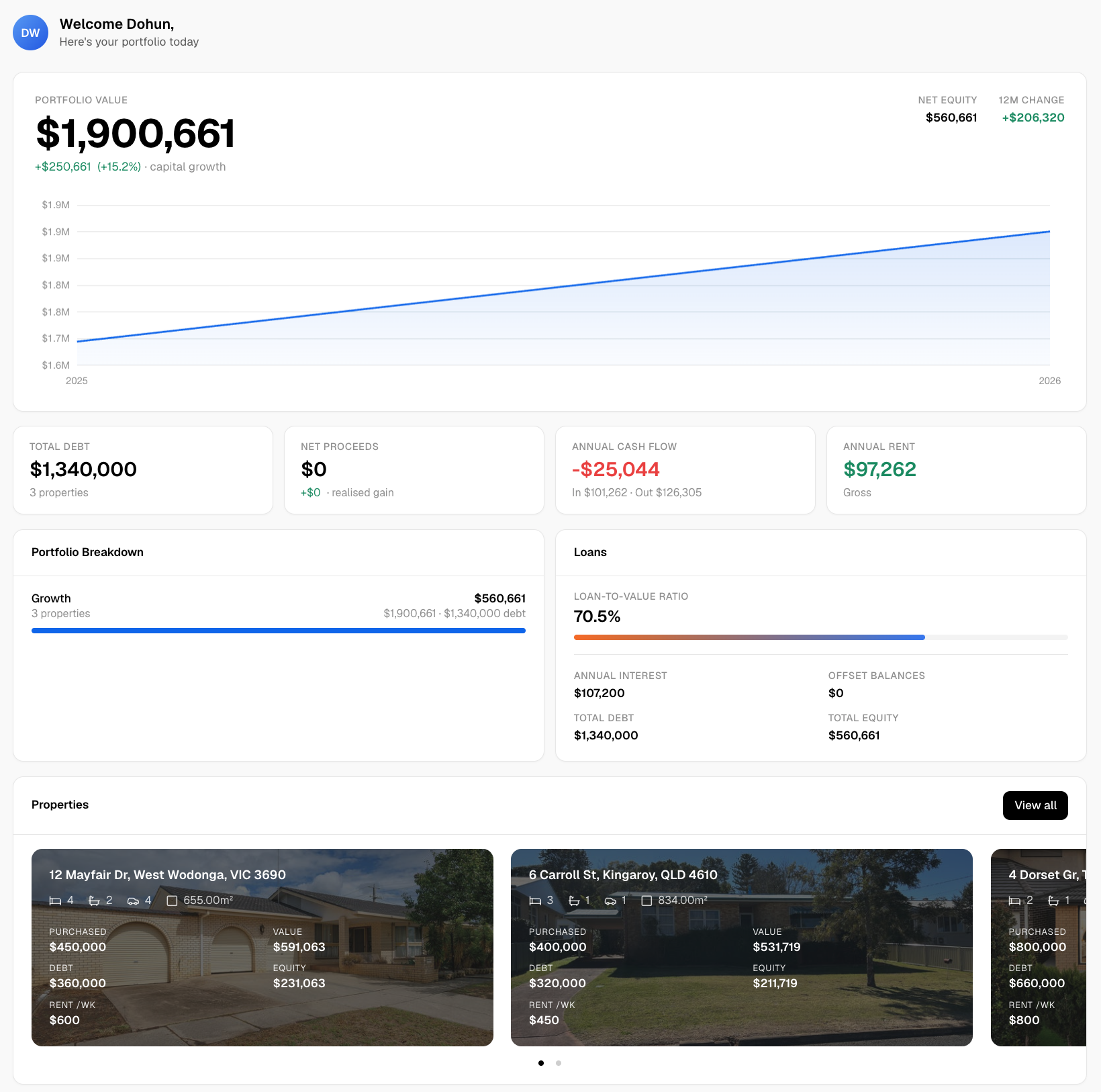
Wealthstacker’s toolkit maps directly to the analytical steps this article describes. Automated quarterly valuations keep your portfolio’s market value current without manual research. Suburb overlays surface vacancy trends, completions pipelines, and local employment data in a single view. The 15-year scenario modelling tool lets you run a combined rate-rise and migration-shock scenario against a specific property before you commit. Borrowing-capacity tools update in real time as rate settings change, so you always know your actual purchasing position.
For investors comparing rentvesting and buying strategies, Wealthstacker’s modelling shows how supply-demand-driven rent growth changes the wealth outcome of each path over a 10–15 year horizon. That is the kind of analysis that used to require a buyer’s agent or a financial planner. Try the free valuation tool at Wealthstacker and see how your current or target suburb sits against the supply-demand indicators covered here.
Sources
- RDP 2019‑01: Housing construction cycles and interest rates (RBA)
- KPMG Residential Property Market Outlook | KPMG Australia
This article is general information, not a substitute for advice from a qualified financial advisor. Consult a qualified financial professional about your own circumstances before acting on anything here.
Recommended
- Owner-occupier vs investor loans: what buyers need to know | WealthStacker
- Property investment checklist for beginners: 2026 guide | WealthStacker
- Passive property investment strategies for Australian professionals | WealthStacker
- Portfolio performance metrics checklist: Australian investor guide | WealthStacker