Property market cycle stages for Australian investors
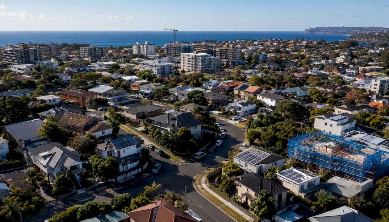
Australian property cycles move through four repeating stages: recovery/upturn, expansion/boom, hyper-supply/peak, and recession/correction. Knowing which stage your target suburb sits in shapes every decision from entry timing to hold strategy to exit.
Three actions worth considering right now:
- Check local indicators first. National headlines routinely lag suburb-level shifts by six to twelve months. Days on market, vacancy rates, and listing volumes tell you more than a city-wide median.
- Match your strategy to the stage. Buying in late recovery or early expansion has historically delivered stronger risk-adjusted returns than entering during expansion, but the best timing may depend on suburb-level indicators and variant cycle durations.
- Run a scenario before you commit. Model at least two rate and vacancy scenarios before acting. The Reserve Bank of Australia (RBA), the Australian Bureau of Statistics (ABS), and suburb-level trackers like HtAG Analytics and Picki give you the raw inputs.
Key takeaways
Australian property cycles follow four repeating stages, and matching your strategy to the current stage of your target suburb, not the national headline, is what separates disciplined investors from reactive ones.
| Point | Details |
|---|---|
| Four stages drive every cycle | Recovery, expansion, hyper-supply, and recession each carry distinct price, vacancy, and sentiment signals. |
| Suburb-level checks are non-negotiable | National and city averages routinely lag or obscure suburb-level turning points by six to twelve months. |
| Late recovery is the historical sweet spot | Buying in late recovery or early expansion has historically delivered stronger risk-adjusted returns than entering during expansion, but outcomes vary by suburb cycle phase. |
| Five indicators beat price data alone | Days on market, vendor discounting, vacancy, clearance rates, and listing volumes together give earlier signals than price indexes. |
| Scenario-test before every entry | Model a rate-rise, vacancy-rise, and flat-rent scenario before committing; Wealthstacker’s modelling tools automate this step. |
Table of Contents
- What is a property market cycle and why does it matter?
- The four property market cycle stages explained
- How long do Australian property cycles typically last?
- What drives Australian property cycles?
- How do you identify which stage a suburb is in?
- Why different Australian cities and suburbs can be in different stages at once
- When should you buy, sell, or hold?
- How to apply valuations and scenario modelling to cycle signals
- Wealthstacker: track cycles and model scenarios in one place
- Sources
What is a property market cycle and why does it matter?
A property market cycle is a recurring sequence of phases driven by the interaction of demand, supply, and financing conditions. Prices rise when demand outpaces supply and credit is accessible, then fall or stagnate when the reverse holds. The cycle repeats, though never on a fixed clock.
Australia’s version of this cycle has some distinctive features. Net overseas migration is a powerful demand lever: RBA research points to population growth and supply constraints as key drivers of housing demand, noting that dwelling completions have remained subdued even as demand rebounded after the pandemic. When migration surges, vacancy rates compress quickly. Supply, however, responds slowly. Approvals take months to lodge; completions follow years later. That lag is one reason Australian cycles can be more pronounced than in comparable markets.
The RBA cash rate adds a second amplifier. An empirical RBA model finds that lower interest rates account for a large share of past housing price strength, and that population growth simultaneously reduces rental vacancies and boosts both prices and construction. When rates fall and migration rises together, the expansion phase can accelerate sharply. When rates rise, the correction can be swift.
Cross-country RBA research confirms that Australia’s housing construction cycle is more sensitive to interest-rate swings than many comparable economies, partly because of how supply elasticity and price responses differ here. That sensitivity is why understanding the cycle matters for Australian investors more than it might elsewhere.
The four property market cycle stages explained
HtAG Analytics frames the Australian cycle in four phases and tracks cycle positions across more than 15,000 suburbs. The profiles below draw on that framework alongside RBA and ABS data.
Recovery/upturn
Prices have bottomed or are stabilising. Sentiment is cautious and media coverage is still negative, but the data tells a different story: days on market start falling, vendor discounting narrows, and listing volumes thin out as sellers hold back. Rents often rise before prices do, compressing yields and attracting yield-focused buyers.
Signs to watch:
- Days on market declining for three or more consecutive months
- Vendor discounting rate falling below its recent average
- Vacancy rates dropping, particularly in tightly held suburbs
- Auction clearance rates recovering from below 50% toward 55–60%
- Building approvals still subdued (supply not yet responding)
- Rental yields at or near cycle highs
- Listing volumes below the five-year seasonal average
Investor actions: Selective buying, particularly in suburbs where vacancy has already tightened. Yield-focused buyers find the best entry points here. Long-term investors with financing in place can act before sentiment turns.
Pro Tip: Construction lags create a buying window in recovery. Because approvals-to-completions can take two to four years for higher-density projects, new supply is minimal at the start of recovery even if approvals begin rising. That window closes once completions catch up.
Expansion/boom
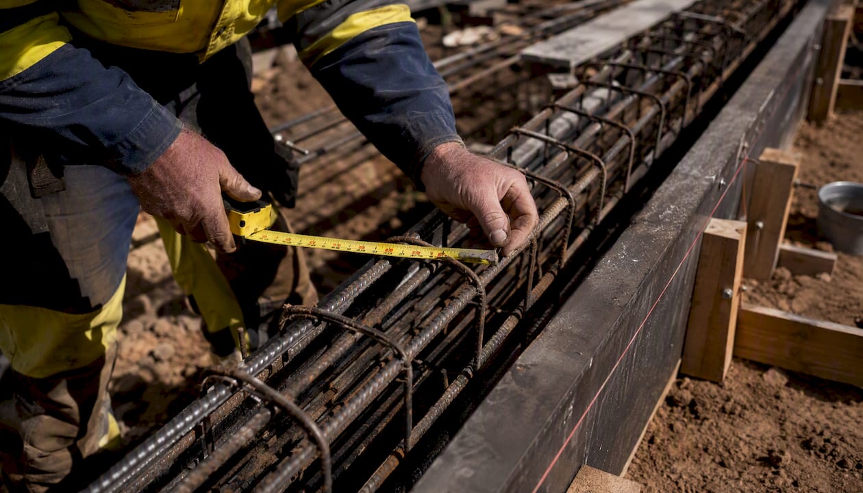
Prices are rising consistently. Sentiment shifts from cautious to optimistic, then to exuberant. Auction clearance rates climb above Auction clearance rates typically reach 65–70%, with days on market compressing sharply, accompanied by strong buyer demand.-driven bidding pushes prices above reserve. Developers respond to rising prices by lodging approvals, but completions are still 18–36 months away.
Signs to watch:
- Auction clearance rates above 65% and rising
- Days on market at or near cycle lows
- Vendor discounting near zero or negative (sales above asking)
- New listing volumes rising as sellers try to capitalise
- Building approvals accelerating
- Media coverage turning bullish
- Rental yields compressing as price growth outpaces rent growth
Investor actions: Hold existing positions and let equity build. New buyers should be selective: late expansion carries the highest entry risk. Developers can lock in feasibility studies and begin pre-sales.
Pro Tip: Yield compression in expansion is a warning signal, not just a feature. When gross yields fall well below the cost of debt, the asset is priced for continued capital growth. If that growth stalls, the holding cost becomes punishing.
Hyper-supply/peak
Price growth slows or plateaus. Supply that was approved during expansion starts hitting the market. Listing volumes rise, days on market lengthen, and vendor discounting creeps back up. Sentiment remains broadly positive but cracks appear: clearance rates drift below 65%, and some properties pass in at auction.
Signs to watch:
- Days on market rising for two or more consecutive months
- Listing volumes above the five-year seasonal average
- Vendor discounting rate increasing
- Auction clearance rates falling from recent highs
- Building completions rising, particularly in apartment-heavy corridors
- Vacancy rates ticking up in oversupplied product types
- Rental growth slowing or stagnant
Investor actions: Reduce exposure to oversupplied product types (high-rise apartments in growth corridors are typically the first to soften). Hold well-located, tightly held assets. Avoid leveraged purchases unless yield can service debt at higher rates.
Pro Tip: Oversupply risk is not uniform. Detached houses convert approvals to completions faster than higher-density projects, but the volume of new apartments in a single corridor can overwhelm local demand. Check product-type vacancy separately, not just suburb-wide vacancy.
Recession/correction
Prices are falling. Sentiment is negative, media coverage is bearish, and forced sales appear. Days on market lengthen significantly, vendor discounting widens, and clearance rates drop below 50%. Rents may hold up or even rise if the correction is rate-driven rather than demand-driven, which can keep yields attractive even as prices fall.
Signs to watch:
- Prices falling on ABS residential property price indexes for two or more consecutive quarters
- Auction clearance rates below 50%
- Days on market at cycle highs
- Vendor discounting above 5–7%
- Distressed listings and mortgagee sales appearing
- Building approvals falling sharply
- Investor sentiment negative; media coverage pessimistic
Investor actions: Preserve cash and maintain financing buffers. Opportunistic buyers with long time horizons can begin researching, but avoid catching a falling knife. The best entry points typically arrive in the second half of recession, when price falls slow and rents stabilise.
Pro Tip: A rate-driven correction often leaves rents intact or rising. If the RBA is cutting rates to support the economy, the recovery phase can arrive faster than sentiment suggests. Watch the RBA cash rate closely during this stage.
Typical phase metrics at a glance
| Phase | Typical 12-month price direction | Days on market trend | Auction clearance rate | Investor signal |
|---|---|---|---|---|
| Recovery | Flat to modest gains | Falling | 55–65% and rising | Selective buy |
| Expansion | Strong gains | At cycle lows | 65–70%+ | Hold / late caution |
| Hyper-supply | Slowing / plateauing | Rising | 55–65% and falling | Reduce risk |
| Recession | Falling | At cycle highs | Below 50% | Preserve cash / research |
How long do Australian property cycles typically last?
There is no fixed trough-to-trough duration for Australian property cycles. Suburb and city cycles vary considerably depending on local supply constraints, population growth, and infrastructure investment. As a general guide, full cycles at the city level have historically spanned roughly seven to ten years from trough to trough, though some markets have moved faster and others have stretched longer.
Individual phases vary even more. A recovery phase in a supply-constrained inner suburb with strong migration-driven demand can last as little as 12–18 months before tipping into expansion. In a regional market with weaker fundamentals, recovery can drag for three or four years. Recession phases in Australia’s major cities have tended to be shorter than in some international markets, partly because population growth sustains underlying demand even during rate-driven downturns.
Construction and approvals lags lengthen the hyper-supply and recession phases in apartment-heavy markets. Because higher-density projects can take two to four years from approval to completion, a wave of approvals lodged during expansion keeps delivering new supply well into the correction. That dynamic has played out in inner-city apartment corridors in Sydney and Melbourne, where vacancy spikes persisted long after price falls began. Detached house markets, where completions follow approvals more quickly, tend to clear oversupply faster.
The practical takeaway: treat any national or city-level cycle duration figure as a rough reference, not a timer. Suburb-level indicators will tell you more about where a specific market sits than any historical average.
What drives Australian property cycles?
Four forces do most of the work, and they rarely move independently.
RBA cash rate and interest costs. The cash rate shapes borrowing costs, serviceability assessments, and investor appetite simultaneously. An RBA model of the Australian housing market finds that lower interest rates account for a substantial share of past price booms, operating partly through the user cost of housing: when the cost of owning falls relative to renting, demand for ownership rises sharply. Rate rises reverse this. Because Australian households carry high levels of mortgage debt relative to income, rate sensitivity here is pronounced. Cross-country RBA research confirms that Australia’s housing cycle responds more strongly to rate movements than many comparable markets.
Population growth and migration. Net overseas migration is the single fastest-moving demand variable in the Australian market. When migration surges, household formation accelerates, vacancy rates fall, rents rise, and prices follow. The RBA’s 2024 housing market speech highlights that supply responds slowly to these demand shifts, so even a temporary migration spike can push a market from recovery into expansion within a year.
Building approvals and completions (supply lags). Approvals are a leading indicator; completions are what actually affects vacancy. The gap between them is where cycle distortions live. A surge in approvals during expansion creates a supply overhang that lands during hyper-supply or recession, amplifying the downturn. Conversely, subdued approvals during recession mean the recovery phase arrives with minimal new supply, accelerating price recovery.
Lending standards and credit conditions. APRA’s macroprudential settings, bank serviceability buffers, and investor lending caps all shape how much credit flows into the market. Tighter lending standards can cut short an expansion phase even when rates are stable. Looser standards amplify booms. The interaction between credit availability and rate levels is particularly important: low rates with tight lending produce a muted cycle; low rates with loose lending produce a sharp one.
When these forces align, cycles become extreme. Low rates, high migration, subdued supply, and loose credit together drove the 2020–2022 expansion in Australian capital cities. When rates rose sharply from 2022, the correction was swift. Understanding which combination is in play helps investors assess not just the current stage but how long it is likely to last.
How do you identify which stage a suburb is in?
The most reliable approach combines leading indicators (which turn before prices do) with coincident indicators (which confirm the turn). Relying on price data alone means you are always reading yesterday’s news.
Indicator checklist:
- Days on market falling → recovery or early expansion signal
- Vendor discounting narrowing → recovery strengthening
- Listing volumes below seasonal average → supply tightening, recovery likely
- Auction clearance rates above 65% and rising → expansion confirmed
- Vacancy rates falling → demand outpacing supply, recovery or expansion
- Building approvals rising sharply → hyper-supply approaching (lagged)
- Days on market rising → hyper-supply or recession signal
- Vendor discounting widening above 3–4% → market softening
- Clearance rates below 50% → recession confirmed
- Rents rising while prices fall → rate-driven correction, recovery may be closer
Picki’s suburb-level cycle analysis emphasises that buying in late recovery or early expansion has historically delivered stronger risk-adjusted returns in many analysed suburbs. The key is identifying the turn before sentiment catches up.
A simple five-indicator scoring method:
- Check days on market trend (3-month direction): falling = +1, rising = -1
- Check vendor discounting rate (vs 12-month average): narrowing = +1, widening = -1
- Check vacancy rate (vs 12-month average): falling = +1, rising = -1
- Check auction clearance rate (latest 4-week average): above 60% and rising = +1, below 55% and falling = -1
- Check listing volumes (vs seasonal average): below average = +1, above average = -1
A score of +3 to +5 points toward recovery or expansion. A score of -3 to -5 points toward hyper-supply or recession. Scores near zero suggest a transition or mixed signals worth monitoring for another month before acting.
Data sources to use:
- ABS residential property price indexes: official quarterly price direction for all eight capital cities
- RBA cash rate statistics: historical and current cash rate for rate-scenario inputs
- HtAG Analytics: suburb-level cycle positions and phase metrics across 15,000+ suburbs
- Picki: suburb-level indicator breakdowns and cycle-phase identification
- ABS building approvals (abs.gov.au): monthly approvals data by dwelling type and state
- APRA lending statistics (apra.gov.au): credit growth, investor lending, and serviceability data
- Cycle Monitor quarterly snapshots: a useful cross-check for validating phase positions using a structured quarterly methodology
Pro Tip: Combining leading indicators (DOM, vendor discounting, listing volumes) with coincident indicators (vacancy rates, rents) reduces false signals. A suburb where DOM is falling but vacancy is still rising is likely in early recovery, not yet confirmed expansion. Wait for both to align before committing.
Why different Australian cities and suburbs can be in different stages at once
Australia does not move as one market. Sydney, Melbourne, Brisbane, Perth, and Adelaide have each been in different cycle stages simultaneously at various points in the past decade. Within a single city, an inner established suburb and a new outer growth corridor can sit in opposite phases.
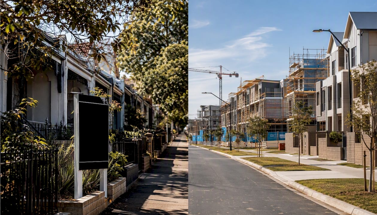
The reasons are structural. Local supply pipelines differ: a suburb with a large apartment development pipeline faces a different supply trajectory than a tightly held suburb of freestanding houses with minimal new stock. Local employment anchors matter too. A suburb near a major hospital, university, or infrastructure project has a demand floor that a dormitory suburb lacks. Migration patterns are not uniform: international students cluster near universities, skilled migrants concentrate near employment hubs, and family formation drives demand in school-catchment suburbs.
Consider two contrasting examples. A tightly held inner suburb with low vacancy, minimal new supply, and strong rental demand from professionals can move from recession to recovery quickly when rates stabilise, because underlying demand never fully evaporated. A new outer growth corridor with hundreds of apartments completing simultaneously can remain in hyper-supply or recession for two to three years even as the broader city recovers, because the local supply overhang takes time to absorb.
The practical rule: never assume the city-wide cycle position applies to your target suburb. Check local vacancy rates, listing volumes, and days on market before acting. National headlines are useful for understanding macro direction; they are unreliable for suburb-level timing. HtAG Analytics tracks cycle positions at suburb level across more than 15,000 suburbs precisely because the national average obscures investable opportunities.
When should you buy, sell, or hold?
Stage recognition is only useful if it connects to a clear action. The matrix below maps four common investor types to recommended stances by phase.
| Investor type | Recovery | Expansion | Hyper-supply | Recession |
|---|---|---|---|---|
| Long-term growth investor | Selective buy | Hold and accumulate equity | Hold; avoid new leveraged buys | Research; buy late-stage |
| Yield-focused buyer | Strong buy (yields at highs) | Hold; yields compressing | Review; yields thinning | Hold if cash flow positive |
| Owner-occupier | Good entry window | Buy if ready; avoid FOMO | Negotiate hard; buyer’s market emerging | Strong negotiating position |
| Developer / renovator | Secure sites and feasibilities | Pre-sell and build | Delay new projects; manage completions | Acquire distressed sites |
A few decision rules worth keeping:
Prefer mid-recovery for selective buys. Late recovery offers the best combination of price certainty (the bottom is confirmed) and upside (expansion not yet priced in). Early recovery carries more timing risk; late expansion carries more price risk.
Avoid late hyper-supply unless yield is exceptional. Buying into a softening market with rising vacancy and a supply pipeline still delivering requires a yield buffer that can carry the asset through a potential correction without forced sale.
Hold through short corrections if fundamentals are sound. Rate-driven corrections in supply-constrained suburbs with strong rental demand have historically been shorter than sentiment suggests. Selling into a correction crystallises a loss that time often recovers.
Risk-management checklist before acting:
- Financing buffer: can you service the debt at 2–3% above current rates?
- Vacancy scenario: can you hold for six months without a tenant?
- Scenario test: have you modelled a 10–15% price fall on your entry price?
- Diversification: are you concentrated in one product type or corridor?
- Equity and leverage: is your LVR should be comfortable if valuations soften by around 10% to manage risk.%?
Understanding how rental yield behaves across cycle phases helps calibrate the yield-versus-growth trade-off at each stage.
How to apply valuations and scenario modelling to cycle signals
Identifying the stage is step one. Turning that identification into a testable investment decision requires a short modelling workflow.
Step 1: Collect local indicators and inputs. Pull the five indicators from the scoring method above for your target suburb. Add the current RBA cash rate from the RBA cash rate statistics page, the local vacancy rate, current gross yield, and any known supply completions scheduled in the next 12–24 months. This is your baseline.
Step 2: Run two or three scenario projections. Test at least:
- A rate-rise scenario (cash rate up 0.5–1.0%): how does serviceability and yield coverage change?
- A vacancy-rise scenario (vacancy up 1–2 percentage points): what does that do to gross yield and cash flow?
- A slower-rent scenario (rent growth flat for two years): how does that affect your 10-year wealth projection?
Each scenario should produce a different net position. The gap between the optimistic and pessimistic scenarios is your risk range.
Step 3: Compare outcomes and set action thresholds. If the pessimistic scenario still produces a positive cash flow or acceptable equity position at your target hold period, the entry is defensible. If the pessimistic scenario produces a cash-flow shortfall you cannot cover from other income, the position is too leveraged for the current stage.
Tools that automate this workflow reduce the time and error involved. Wealthstacker, for example, provides automated quarterly property valuations, 15-year investment modelling for both rentvesting and buying scenarios, borrowing power estimations, and an AI-powered investment assistant for testing inputs. For investors who want to run investment property forecasting across multiple scenarios without building a spreadsheet from scratch, a platform like Wealthstacker handles the modelling layer while you focus on interpreting the cycle signals.
The modelling inputs that matter most at each stage: cash rate moves (expansion and recession phases), vacancy percentage changes (hyper-supply phase), rent growth assumptions (all phases), and construction completions lag (hyper-supply and recovery phases).
Wealthstacker: track cycles and model scenarios in one place
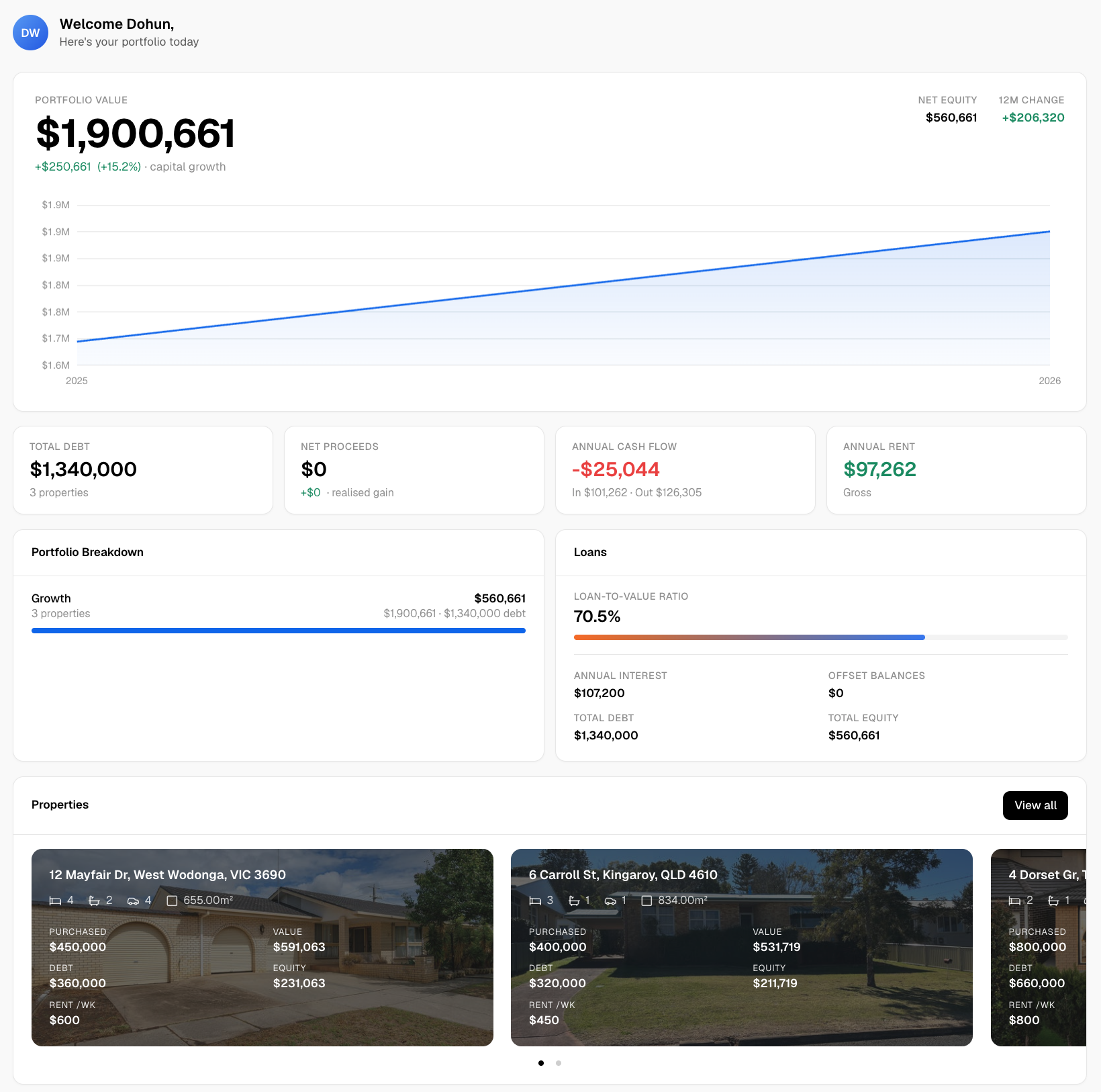
Understanding property market cycle stages is only half the job. Acting on them requires current valuations, scenario modelling, and a clear view of your portfolio’s position relative to the cycle.
Wealthstacker brings all of that into one toolkit. Free automated quarterly valuations keep your property values current without manual research. The 15-year investment modelling tool lets you compare rentvesting and buying scenarios across different rate and vacancy assumptions, so you can stress-test an entry decision before committing. The borrowing power estimator and AI-powered investment assistant help you work through the inputs that matter for your specific situation.
Start with Wealthstacker’s free toolkit and see where your target suburb sits in the cycle today.
Sources
- Housing market cycles and fundamentals (speech) — Reserve Bank of Australia
- Residential property price indexes, eight capital cities — ABS
- The property market cycle in Australia: 4 phases — HtAG Analytics
- Property market cycles Australia 2026: Identify suburb cycle phase — Picki
- Cycle Monitor Q4 2024 — Daniels / cycle-monitor